In the intro to the X-File page there is mention of doubts over a particular form of computer colouring, a question over the aesthetics of one approach to colouring comics. There is the suggestion that the reservations will be reappraised. Well I have done that and decided I was right first time - or at least I am now prepared to state a clear preference and try to explain why.
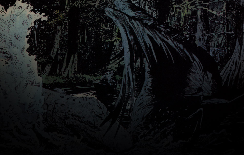
Looking at lots of comic art lately on the internet there are many examples of the kind of colouring that despite it’s popularity and the skill of those applying it I have misgivings about. It is when colourists use shaded tones and accentuated highlights to model form that misgivings arise. Often this diminishes or disregards the artists modelling with line. An artist’s individualistic line work is reduced to a scaffold for bravura displays of a colourist’s technical ability. Effects created can be impressive and would be difficult to produce any other way. That seems to be part of the problem - since a shining light is so simple to do let’s do one.
If that might appear as special pleading for a kind of drawing I happen to admire I have an additional problem with much of this colouring method. The bullying of every frame with shading, modelling, lighting effects, gleams and sparkles to give it the qualities of a photograph is distancing for the reader and unsympathetic to the narrative. Each frame is given equal weight.
It is not just nostalgia that gives me a preference for the two dimensional quality of a comic book page that computer colouring artists are so good at undermining. The basic cleanness and clarity of a coloured line drawing is one of comics and cartoons contribution to aesthetics. Their flat page simplicity part of their appeal and pleasure
Colour me grouchy.
Colour me grouchy.

In the intro to the X-File page there is mention of doubts over a particular form of computer colouring, a question over the aesthetics of one approach to colouring comics. There is the suggestion that the reservations will be reappraised. Well I have done that and decided I was right first time - or at least I am now prepared to state a clear preference and try to explain why.
Looking at lots of comic art lately on the internet there are many examples of the kind of colouring that despite it’s popularity and the skill of those applying it I have misgivings about. It is when colourists use shaded tones and accentuated highlights to model form that misgivings arise. Often this diminishes or disregards the artists modelling with line. An artist’s individualistic line work is reduced to a scaffold for bravura displays of a colourist’s technical ability. Effects created can be impressive and would be difficult to produce any other way. That seems to be part of the problem - since a shining light is so simple to do let’s do one.
If that might appear as special pleading for a kind of drawing I happen to admire I have an additional problem with much of this colouring method. The bullying of every frame with shading, modelling, lighting effects, gleams and sparkles to give it the qualities of a photograph is distancing for the reader and unsympathetic to the narrative. Each frame is given equal weight.
It is not just nostalgia that gives me a preference for the two dimensional quality of a comic book page that computer colouring artists are so good at undermining. The basic cleanness and clarity of a coloured line drawing is one of comics and cartoons contribution to aesthetics. Their flat page simplicity part of their appeal and pleasure
- Login to post comments

